
'Don't judge a book by its cover.'
And I will have to cover my ears from the echoing 'really? really? really' that sweeps over all the rooms in the back of my mind.
No, I mean, really. If you have no idea about a book, have never heard of it even once, the first thing you're gonna recognize about a book after or even together with its author is either the spine (if you're seeing it standing erected on a shelf) or the cover of the book (if you're seeing it at the topmost of a stack from above, or lying closed on the carpet, or clutched tightly by some stranger on the street, or referenced in various media). Not even the synopsis. No. You have no idea about the story at all. No premise. But you know something about the book. The cover. And subsequently a question: What is this cover trying to convey?
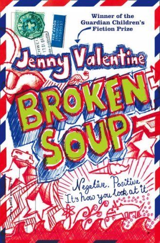
I have, during several occasions, picked books based on my curiosity to the previous question. Or simply just because the covers caught my eye instantly. Or any 'award' or 'finalist' emblems embedded on them. Not gonna lie. Especially during my secondary school days where I had very minimal references for good reads… (see the rules of survival and broken soup)
Now I do so less (anyone will as s/he begins to gather sources of book recommendations s/he is comfortable with), although I still take pleasure in having or reading books with good covers. Admittedly, if there are two versions of the book; I will definitely pick the one with the better cover. Simple logic? Not really, since we are bounded by the 'don't judge…' idiom. According to the idiom, if the contents are really the same, both books should have equal chances of being picked. But the truth is: of course no!
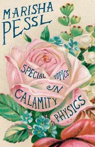
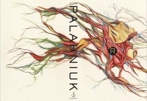
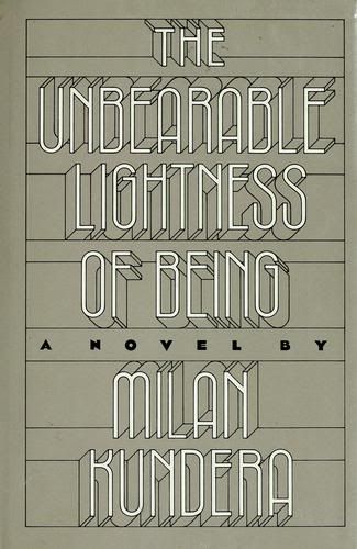
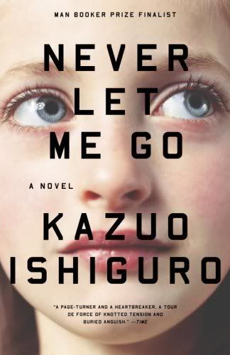
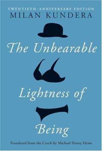
Here are my favorite covers of some books that i have read/tried to read/owned (some of them come in a few versions):

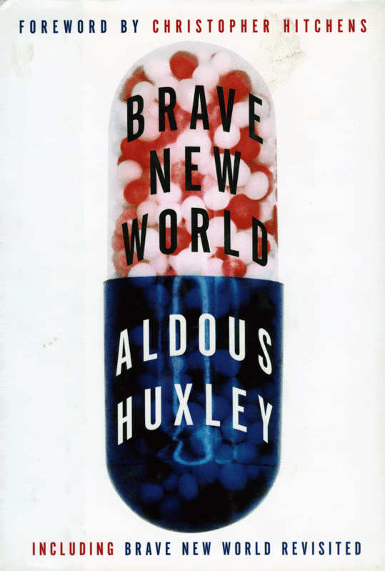


The first one (Brave New World) looks MUCH prettier in real life.
I was so glad to have gifted my boyfriend the book in this version--the sides of the papers had this cute raw-cut look. Plus, the little circles dotting the cover actually arose slightly, taking appearances of some golden nails. Before handing it to my boyfriend, groping the cover was one of my hobbies…the texture was just there for me to be felt. And the blue--the blue was really beautiful, not as dark, but deeper and richer in real life.
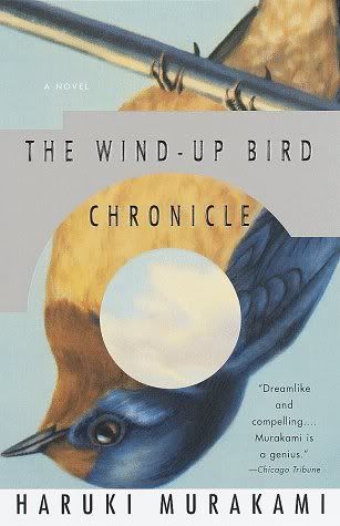
I really like this version of Norwegian Wood cover (fourth picture). The one that I bought looked really stupid and ugly (like a mini movie poster pasted over the cover), but I didn't really liked the book anyway.
I like this cover of The Virgin Suicides (ninth picture). It's also the copy that I read, so grateful because I know there is another version of the cover with a (very) bad choice for font and photography. This version seems to portray everything the characters in the book are trying to achieve or sustain--youth and freedom, lush and lust.
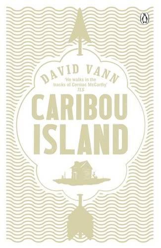
Caribou Island (twelfth picture) has a neat, tempting graphic on its cover. I like their use of golden ripples as its background. Cold, isolated, grand, full of desire for warmth.
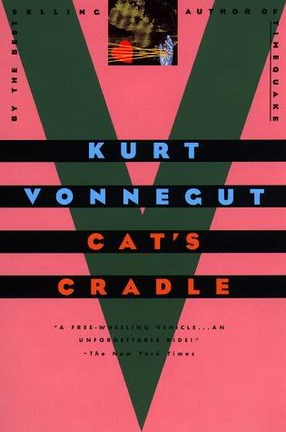
I read Cat's Cradle with the thirteenth picture as its cover, The first one does more explanation, though (via the footnote: novel = a harmless untruth, a concept from the book that I really dig…)
The Bell Jar has a lot of different covers--I read the one with the less interesting picture on its cover. I really like the fourteenth one, bubble-gum girl, not here not there. Beautiful photograph…
Of course, the covers just spiced up my reading. The contents were the reason why these books had lived a short/long life in my shelves, after all. You can read some of the reviews/essays I made on these books here.
No comments:
Post a Comment