
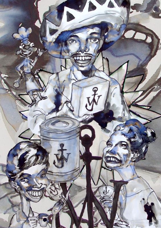
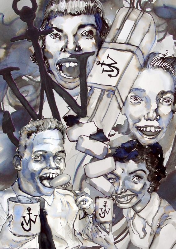
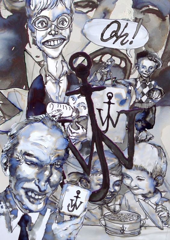
These illustrations by Gary Card have perhaps almost zero correlation with J.W. Anderson x Topshop collection, except for that J.W logo dispersed generously on each picture. A pot of soup with J.W. Anderson logo on it? One could only imagine. In its infancy, the initial seems to be trying to pervade our lives the way Chanel's double-C's or YSL's retired Y have for so many years. No complaint, except that maybe I am not very used to dissociate the logo from a picture of life-saving anchor grounded to the depth of the sea? Or is such dissociation indeed never the designer's true intention?
Meanwhile I quite like their collaboration pieces with Topshop. Nothing unconventional, but still fun.
No comments:
Post a Comment